Acclamation Point Corporation Identity
Client
ACCLAMATION POINT CORPORATION
Services
BRANDING & IDENTITY
Year
2019
Visualizing a company named after a unique punctuation mark.

The little-known acclamation point looks like an exclamation point, but with two upraised ‘arms’ instead of one. It signifies good-natured intent and welcome.


the identity
skillful • trustworthy • creative
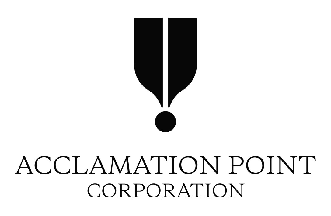
The logomark is both a stylized acclamation point and a shield. The former reflects the corporation’s unique name while the latter represents their trustworthiness.
A third interpretation sees the logomark as a nib, symbolizing APC’s creative products and content generation.
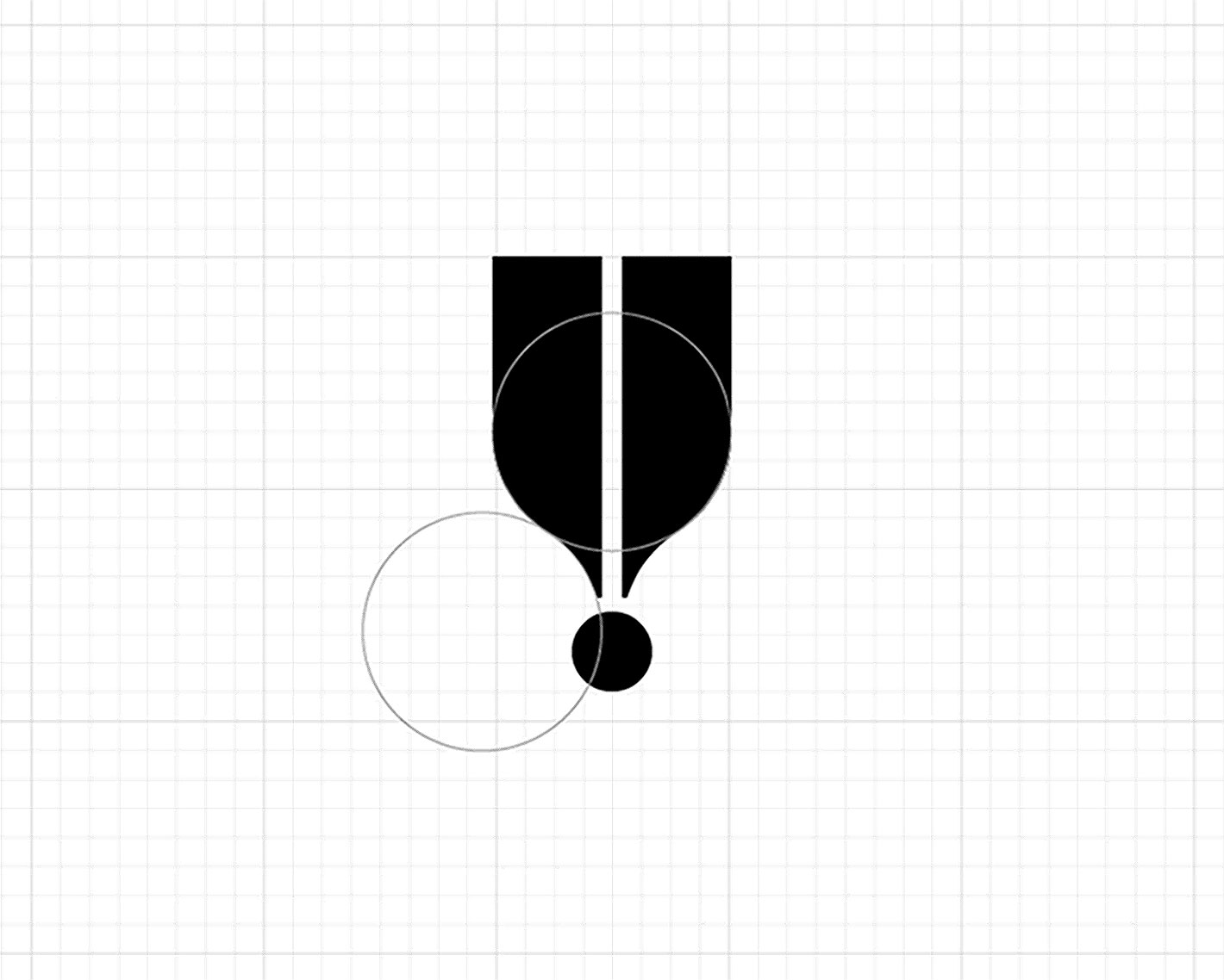
Inspired by Adrian Frutiger and Sagi Haviv, I designed the mark with elegance in mind so that it would buck trends and stay in use for a long time.

Typography & color palette
Effortless elegance • Surprising hues

Galaxie Copernicus is billed as a “reconsideration” of Plantin—and it’s just as versatile. Formal yet inviting, it pairs well with various typefaces.

Mimosa’s understated glow is set off by the blue undertones of Cool Grey. An uncommon palette, it nevertheless makes for a professional combination.
